# 원형 및 도넛형 도표
## Content
`원형` 및 `도넛형` 도표는 전체 중 부분의 크기를 비교하는 방법을 보여주는 데 적합합니다.
* `원형` 도표는 `데이터 값`을 조각으로 나뉜 디스크로 인코딩합니다.
* `도넛형` 도표는 `데이터 값`을 세그먼트로 나뉜 링으로 인코딩합니다.
두 가지 경우 모두 조각 또는 세그먼트의 호 길이는 `데이터 값`의 해당 부분에 비례합니다. 아래 예에서 **데이터 값**은 굵은 글꼴을 사용하여, *부분*은 기울임꼴 글꼴을 사용하여 강조합니다. 또한 디스크 조각과 링의 세그먼트에 대해 모두 `원형 섹터`라는 용어를 사용합니다.
### 단일 값 원형 도표
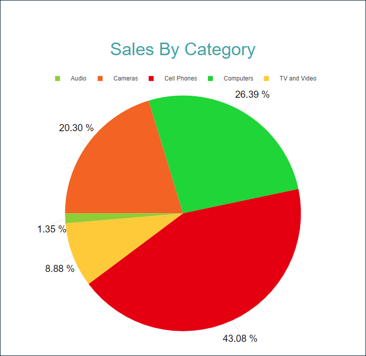
단일 값 원형 도표는 데이터 값 하나의 부분을 시각화합니다.
예를 들어, [원형 도표 데모](/activereportsjs/demos/Reports/PiePlot/purejs)에서는 **순 매출**에 대한 *제품 범주*의 기여도를 보여줍니다.
### 여러 값 도넛형 도표
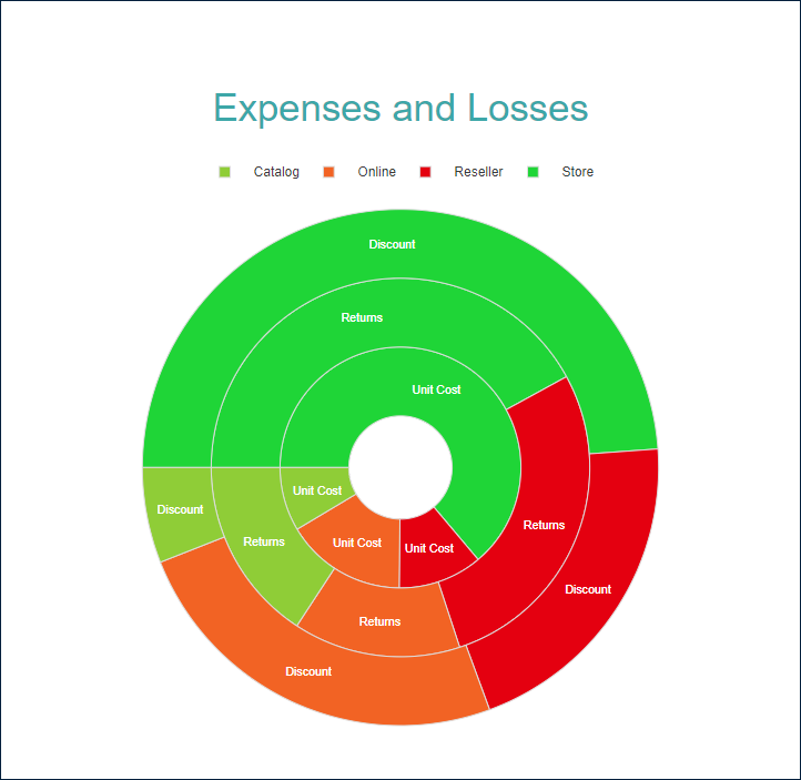
원형 또는 도넛형 도표를 사용하여 공통 부분으로 나뉜 여러 값을 표시할 수도 있습니다.
예를 들어, [도넛형 도표 데모](/activereportsjs/demos/Reports/DoughnutPlot/purejs)는 **할인**, **반품** 및 **단가**에 대한 *제품 범주*의 기여도를 보여줍니다.
### 원형 가로 막대형 도표
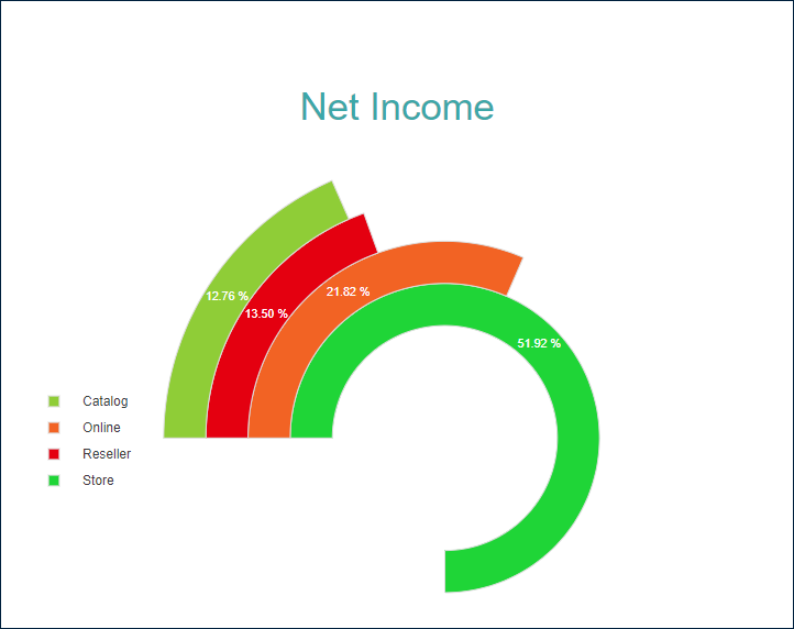
이 구성은 도넛형 세그먼트를 서로 옆에 배치하여 원형 가로 막대형 도표를 만듭니다.
예를 들어, [원형 가로 막대형 도표 데모](/activereportsjs/demos/Reports/CircularBarPlot/purejs)에서는 **순 수익**에 대한 *판매 채널*의 기여도를 보여줍니다.
다음 섹션에서 설명하는 `원형` 템플릿과 속성을 사용하여 이러한 모든 유형을 구성할 수 있습니다. `도넛형` 템플릿은 미리 구성된 `내부 반경` 속성 값에 대한 바로 가기입니다.
다음 데모를 사용하여 도표 속성을 살펴보고, 링크를 열고, [보고서 탐색기](/activereportsjs/docs/ReportAuthorGuide/Report-Designer-Interface#report-explorer)를 토글하고, `도표 - 도표 1` 노드를 선택하고, [속성 패널](/activereportsjs/docs/ReportAuthorGuide/Report-Designer-Interface#properties-panel)을 사용하여 구성을 수정할 수 있습니다.
* [원형 도표 데모](/activereportsjs/demos/Reports/PiePlot/purejs)
* [도넛형 도표 데모](/activereportsjs/demos/Reports/DoughnutPlot/purejs)
* [원형 가로 막대형 도표 데모](/activereportsjs/demos/Reports/CircularBarPlot/purejs)
아래 나열된 보고서 파일을 다운로드하여 [독립 실행형 보고서 디자이너](/activereportsjs/docs/ReportAuthorGuide/QuickStart/Get-Started-With-Designer-App)에서 열 수 있습니다.
* [원형 도표 보고서](/activereportsjs/demos/en/sample/Reports/PiePlot/purejs/PiePlot.rdlx-json)
* [도넛형 도표 보고서](/activereportsjs/demos/en/sample/Reports/DoughnutPlot/purejs/DoughnutPlot.rdlx-json)
* [원형 가로 막대형 도표 보고서](/activereportsjs/demos/en/sample/Reports/CircularBarPlot/purejs/CircularBarPlot.rdlx-json)
### Chart Wizard
If you [add a chart](/activereportsjs/docs/v6.1/#adding-a-chart) into a report, set the plot type to `Pie` or `Doughnut` on the first page of the `Chart Wizard`, and click the `Next` button, the wizard shows the `Pie Settings` or `Doughnut Settings` page that looks like the following:
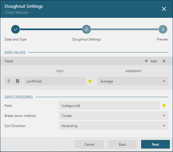
The `Data Values` section allows you to add one or more [Data Values](/activereportsjs/docs/v6.1/#data-values).
The `Data Categories` section allows you to configure the [Details Encoding](/activereportsjs/docs/v6.1/#details-encoding).
### 데이터 값
원형 도표의 `값` [컬렉션](/activereportsjs/docs/ReportAuthorGuide/Report-Items/Common-Properties#collection)은 부분으로 나누려는 데이터 값을 결정합니다. 컬렉션 항목은 다음 두 가지 속성으로 구성됩니다.
* `값`은 일반적으로 [바인딩된 필드 참조](/activereportsjs/docs/ReportAuthorGuide/Expressions/references#data-set-fields)입니다. *참고: 이 속성은 컬렉션이지만 `원형` 도표는 첫 번째 항목만 사용합니다.*
* `집계`는 여러 필드 값을 단일 값으로 줄이는 선택적 함수입니다(예: `Count` 또는 `Average`).
예를 들어, [원형 도표 데모](/activereportsjs/demos/Reports/PiePlot/purejs)에 `Value={SalesAmount}, Aggregate=Sum` 데이터 값이 있습니다.
### 세부 정보 인코딩
`세부 정보 인코딩`은 여러 속성으로 구성된 항목의 `세부 정보` [컬렉션](/activereportsjs/docs/ReportAuthorGuide/Report-Items/Common-Properties#collection)에 지정된 부분으로 데이터 값을 나눕니다.
* `값`은 일반적으로 하나 이상의 [바운딩 필드 참조](/activereportsjs/docs/ReportAuthorGuide/Expressions/references#data-set-fields)입니다. 해당 필드와 값이 동일한 바인딩된 데이터 집합 레코드는 동일한 부분에 속합니다. 각 부분 내 데이터 값은 `집계` 함수를 적용하여 단일 값으로 줄어듭니다. 예를 들어, `원형 도표 데모`에서 도표 `세부 정보` 값은 `{ProductCategory}`입니다. 따라서 `순 매출`을 나타내는 디스크가 고유한 제품 범주에 해당하는 여러 원형 섹터로 나뉩니다.
* `Null 제외` 플래그는 정의되지 않은 `세부 정보 값`이 있는 데이터 집합 레코드가 시각화에서 제외되어야 함을 나타냅니다.
* `그룹` 속성은 도표가 원형 섹터를 배열하는 방법을 결정합니다.
* `누적` \- 기본값입니다\. `원형 도표`는 디스크를 조각으로 나눕니다. `도넛형 도표`는 링을 세그먼트로 나눕니다.
* `묶음` \- 도표에서 원형 섹터를 서로 옆에 배치하여 [원형 가로 막대](/activereportsjs/demos/Reports/CircularBarPlot/purejs)를 만듭니다.
* `없음` - `누적`과 동일합니다.
* `정렬` 구성은 원형 섹터 모양의 순서를 결정합니다.
*참고: `원형` 도표는 세부 정보 컬렉션의 첫 번째 항목만 사용하고 나머지는 무시합니다.*
### 색 인코딩
`색 인코딩`은 `세부 정보 인코딩`의 [색 범례](/activereportsjs/docs/ReportAuthorGuide/Report-Items/Data-Regions/Chart/legend)를 활성화하고 `색` [식](/activereportsjs/docs/ReportAuthorGuide/Expressions)과 여러 `색` 값을 하나의 값으로 줄이는 선택적 `색 집계` 함수를 포함합니다.
도표는 `세부 정보 인코딩`으로 생성된 부분에 대해 고유한 `색 인코딩` 결과를 계산하여 그 결과를 해당 원형 섹터의 채우기 색으로 변환하고, 범례에 색과 인코딩 결과 간 일치를 표시합니다. 색은 [차트 팔레트](/activereportsjs/docs/ReportAuthorGuide/Report-Items/Data-Regions/Chart#general-chart-configuration)에서 가져옵니다.
예를 들어, 원형 도표 데모에서는 색 인코딩에 `{ProductCategory}` 식을 사용합니다. 따라서 보고서 출력에는 제품 범주를 해당 영역의 조각 채우기 색상과 일치시키는 [색 범례](/activereportsjs/docs/ReportAuthorGuide/Report-Items/Data-Regions/Chart/legend)가 표시됩니다.
*참고: `색` 속성은 컬렉션이지만 `원형` 도표는 첫 번째 항목만 사용합니다.*
### 도표의 모양 및 느낌
다음 속성을 사용하면 `원형`, `도넛형` 또는 `원형 가로 막대형` 도표를 구성하는 원형 섹터의 모양을 미세 조정할 수 있습니다. 모든 데모의 구성을 수정하여 그 결과를 실제로 확인할 수 있습니다.
`불투명도`는 색으로 채워지는 원형 섹터의 불투명도를 결정하는 [숫자](/activereportsjs/docs/ReportAuthorGuide/Report-Items/Common-Properties#scalar)(%)입니다. `100%`는 불투명한 상태를, `0%`는 완전히 투명한 상태를 의미합니다.
`내부 반경`은 디스크 가운데 있는 구멍의 크기를 정의하는 외부 반경의 비율을 나타내는 [숫자](/activereportsjs/docs/ReportAuthorGuide/Report-Items/Common-Properties#scalar)(%)입니다. 예를 들어, [도넛형 도표 데모](/activereportsjs/demos/Reports/DoughnutPlot/purejs)에서 이 설정은 `20%`로 설정됩니다.
`오프셋`은 원형 또는 도넛형 도표의 원형 섹터 간 크기를 정의하는 호 길이를 나타내는 [숫자](/activereportsjs/docs/ReportAuthorGuide/Report-Items/Common-Properties#scalar)(%)입니다. [원형 도표 데모](/activereportsjs/demos/Reports/PiePlot/purejs)에서 이 속성을 `10%`로 설정해 보십시오.
`시작 각도`는 도표 시계 방향의 회전을 정의하는 [숫자](/activereportsjs/docs/ReportAuthorGuide/Report-Items/Common-Properties#scalar)(호 각도)입니다. 전체 회전은 `360`도입니다.
`스윕`은 도표가 차지하는 호 길이를 결정하는 `0`\~ `360` 범위의 [숫자](/activereportsjs/docs/ReportAuthorGuide/Report-Items/Common-Properties#scalar)(호 각도)입니다. 예를 들어, [원형 가로 막대형 도표 데모](/activereportsjs/demos/Reports/CircularBarPlot/purejs)에서는 이 속성을 `270`으로 설정합니다.
`클리핑 모드`는 [도표 영역](/activereportsjs/docs/ReportAuthorGuide/Report-Items/Data-Regions/Chart#plot-area)이 도표를 그리는 방식을 나타냅니다.
* `맞춤` 값은 도표 영역에서 도표를 맞추기 위해 사용 가능한 모든 공간을 사용해야 함을 의미합니다.
* `자르기` 값은 도표 영역이 오른쪽 또는 아래쪽 안쪽 여백의 가장자리에서 도표를 절단함을 나타냅니다.
* `없음` 값은 `맞춤`과 동일합니다.
`스타일` 섹션의 [선](/activereportsjs/docs/ReportAuthorGuide/Report-Items/Common-Properties#line-properties) 속성은 원형 섹터 테두리의 모양을 결정합니다.
`배경` 섹션의 색 [식](/activereportsjs/docs/ReportAuthorGuide/Report-Items/Common-Properties#expression)은 원형 섹터의 채우기 색을 설정하고 앞에서 설명한 `색 인코딩`을 덮어씁니다.
### 도구 설명 및 레이블 템플릿
The `Text Encoding` collection offers a way to configure pie and doughnut plots to display customized labels and tooltips on the circular sectors. Each item within this collection has the following properties:
* `Values`: This is an expression that can reference the values of the bound fields.
* `Aggregate`: This optional function, such as `Count` or `Average`, can condense multiple field values into a single value, evaluated within the current detail or category context.
* `Template Key`: A string used within the Labels or Tooltip template to represent the text encoding item.
* `Target`: This property specifies whether the text encoding item is meant for the plot's labels or tooltips.
Adding items to the `Text Encoding` collection allows automatic display of configured values in Labels or Tooltips, based on the `Target` value of each item. To further customize the text of the labels and tooltips, you can employ the `Tooltip Template` and `Label Text Template` expressions.
Apart from Text Encoding items referenced by their keys, you can utilize the following pre-defined values:
드롭다운 목록에서 다음 값 중 하나를 선택할 수 있습니다.
* `{valueField.name}`: 일반적으로 `데이터 값`에 바인딩된 필드 이름을 의미합니다.
* `{valueField.value}`: 포함 범주 또는 세부 정보 내 현재 `데이터 값`을 의미합니다.
* `{PercentageDetail}`: `세부 정보`가 동일한 모든 값 중에서 현재 `데이터 값`의 점유율(%)을 의미합니다.
* `{detailFields.name}`: 일반적으로 `세부 정보 인코딩`에 바인딩된 필드 이름을 의미합니다.
* `{detailFields.value}`: 현재 `세부 정보 인코딩` 값을 의미합니다.
* `{colorField.name}`: 일반적으로 `색 인코딩`에 바인딩된 필드 이름을 의미합니다.
* `{colorField.value}`: 현재 `색 인코딩` 값을 의미합니다.
These values can be combined and formatted using the [interpolation syntax](/activereportsjs/docs/v6.1/#interpolation-syntax) and supported format strings that are also used for the [TextBox Report Item](/activereportsjs/docs/v6.1/#content).
For example, the plot in the [Pie Plot Demo](/activereportsjs/demos/Reports/PiePlot/purejs) uses an advanced tooltip configuration:
* The `Text Encoding` contains the `SalesQuantity` element that displays the number of sold items:
* `Aggregate` = `Sum`
* `Value` = `{SalesQuantity}`
* `Target` = `Tooltip`
* `TemplateKey` = `SalesQuantity`
* The `Tooltip Template` is configured with the following expression:
```
{detailFields.value}
Quantity: {SalesQuantity}
Amount: {valueField.value:C2}
```
### 레이블 모양
`레이블 텍스트` 섹션의 [텍스트 속성](/activereportsjs/docs/ReportAuthorGuide/Report-Items/Common-Properties#text-properties) 하위 집합 및 `레이블 테두리` 섹션의 [선 속성](/activereportsjs/docs/ReportAuthorGuide/Report-Items/Common-Properties#line-properties)을 사용하면 도표 레이블의 해당하는 시각적 매개 변수를 설정할 수 있습니다.
픽셀로 표시되는 `레이블 위치` 및 선택적 `오프셋`은 부모 원형 조각을 기준으로 레이블의 위치를 결정합니다.
* `내부` \- 가장자리에
* `외부` \- 외부에
* `가운데` \- 내부 가운데
* `자동` - `외부`와 같음
`겹치는 레이블` 속성은 겹치는 레이블의 처리를 나타냅니다. 가능한 값은 다음과 같습니다.
* `자동` \- 겹침을 방지하기 위해 일부 레이블을 숨깁니다\.
* `표시` \- 계속해서 겹치더라도 모든 레이블을 표시합니다\.
`레이블 선` 섹션의 [선 속성](/activereportsjs/docs/ReportAuthorGuide/Report-Items/Common-Properties#line-properties)을 사용하면 레이블과 부모 원형 섹터 사이에 연결 선을 추가할 수 있습니다. `레이블 선 위치`는 섹터를 기준으로 선의 시작점을 결정합니다.
* `자동` \- 가장자리에
* `가운데` \- 가운데
### Dynamic Rules
The `Rules` configuration allows you to create `if this then that` rules based on one or more data conditions to apply to the plot appearance. A condition is an [expression](/activereportsjs/docs/v6.1/#expression) that may refer to one of the following values:
* `Chart!CurrentData` \- the current `Data Value`
* `Chart!PreviousData` \- the previous `Data Value`
* `Chart!NextData` \- the next `Data Value`
* `Chart!CurrentCategory` \- the current `Category Encoding` value
* `Chart!PreviousCategory` \- the previous `Category Encoding` value
* `Chart!NextCategory` \- the next `Category Encoding` value
* `Chart!CurrentDetail` \- the current `Details Encoding` value
* `Chart!PreviousDetail` \- the previous `Details Encoding` value
* `Chart!NextDetail` \- the next `Details Encoding` value
A condition expression can also include references to [report parameters](/activereportsjs/docs/v6.1/#parameters) and standard [operators](/activereportsjs/docs/v6.1/). The easiest way to build a condition is to use the expression editor that you can open by click on the box on the right side of the `Condition` property.
The following visual properties of `Pie` and `Doughnut` plots can be applied when a condition is met:
* The background color of a disk slice or a ring sector
* The color of the disk slice or ring sector border
* The width of the disk slice or ring sector border
* The style of the disk slice or ring sector border
* The tooltip and label template
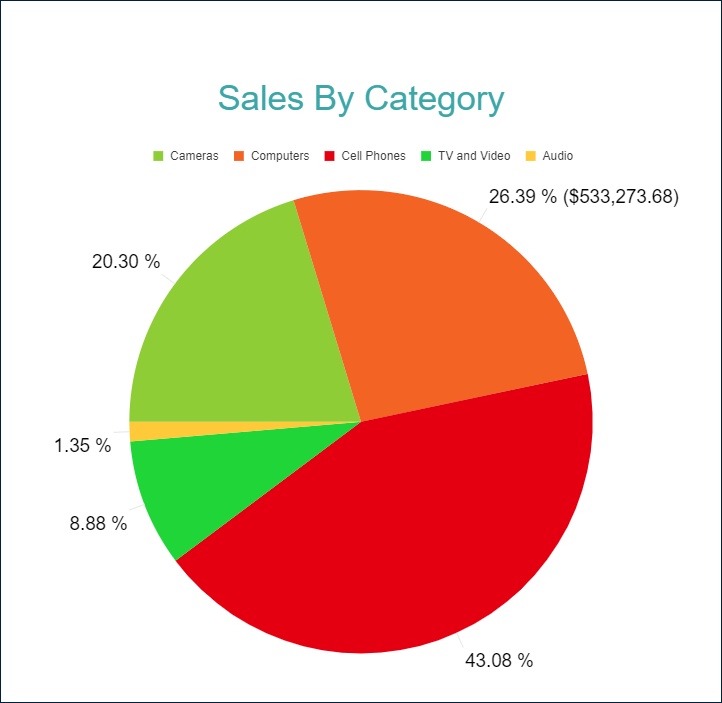
For instance, you can set the following rules for the plot in the [Pie Plot Demo](/activereportsjs/demos/Reports/PiePlot/purejs) to set a custom label template for the `Computers` sector:
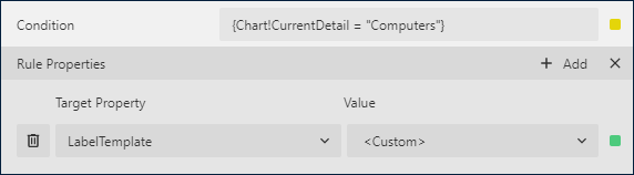
where the custom label template is `{PercentageCategory:p2} ({valueField.value:C2})`
As a result, the output of the chart will be like this:
### 작업
이 속성은 보고서 구독자가 원형 조각의 내부를 클릭할 때 [대화형 작업](/activereportsjs/docs/ReportAuthorGuide/Interactivity#action-property)을 결정합니다. [바인딩된 필드 참조](/activereportsjs/docs/ReportAuthorGuide/Expressions/references#data-set-fields)를 사용하여 드릴스루 보고서의 매개 변수를 전달하거나 동적 책갈피 또는 URL을 구성할 수 있습니다. 필드 값은 현재 세부 정보의 범위 내에서 평가됩니다. 자세한 내용은 [드릴스루 보고서 연습](/activereportsjs/docs/ReportAuthorGuide/QuickStart/분석-보고서-시작하기/Get-Started-With-DrillThrough-Reports)을 참조하십시오. 여기서는 드릴스루 [세로 막대형 도표](/activereportsjs/docs/ReportAuthorGuide/Report-Items/Data-Regions/Chart/plot/column)를 설정하는 방법에 대해 설명하지만 동일한 기법을 원형 도표에도 적용할 수 있습니다.