# 폭포 차트
## Content
**폭포 차트**는 연속적인 양수 및 음수 값이 누적 합계에 어떻게 기여하는지를 보여줍니다. 일반적으로 이익 변화, 예산 차이, 판매 실적 또는 기타 증분 값의 변화를 분석하는 데 사용됩니다.
각 막대는 개별 기여도를 나타내며, 마지막 막대는 선택적으로 누적 합계를 표시할 수 있습니다.
## 범주 구성
폭포 차트는 하나의 범주 필드를 사용합니다.
여러 범주 수준이 바인딩된 경우 첫 번째 수준만 사용됩니다. 중첩된 범주 수준은 무시되며 표시되지 않습니다.
예측 가능한 레이블 동작을 위해 폭포 차트를 구성할 때는 단일 수준 범주 필드를 사용하는 것이 좋습니다.
## 기본 폭포 차트
다음 예제는 최소한의 폭포 차트 구성을 생성합니다.
```javascript
const sheet = spread.getActiveSheet();
sheet.name("Waterfall Chart");
const dataChart = sheet.dataCharts.add(
'waterfall-chart',
10, 10, 600, 400,
GC.Spread.Sheets.DataCharts.DataChartType.waterfall
);
dataChart.setChartConfig({
tableName: 'Profits',
plots: [{
type: GC.Spread.Sheets.DataCharts.DataChartType.waterfall,
encodings: {
values: [{
field: 'Value',
aggregate: GC.Spread.Sheets.DataCharts.Aggregate.sum
}],
category: {
field: 'Category'
}
}
}]
});
```
## 폭포 차트 전용 설정
폭포 차트는 `config.waterfall` 객체 아래에 전용 구성 옵션을 제공합니다.
| **속성** | **설명** | **미리 보기** |
| --- | --- | ----- |
| `showTotal` | 차트에 최종 합계 막대를 표시할지 여부를 제어합니다.
`true`로 설정하면 표시하고, `false`로 설정하면 마지막 요약 열을 숨깁니다. | 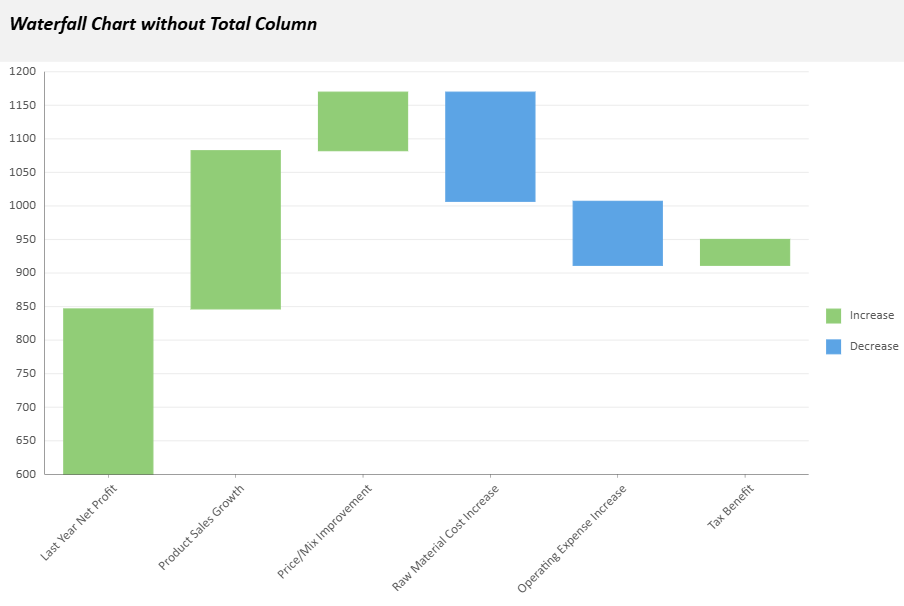 |
| `totalLabel` | 합계 열에 사용할 텍스트 레이블을 지정합니다(기본값: `"Total"`). | 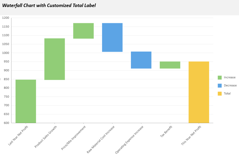 |
| `orientation` | 차트 방향을 지정합니다. `"vertical"`(기본값) 또는 `"horizontal"`을 사용할 수 있습니다. | 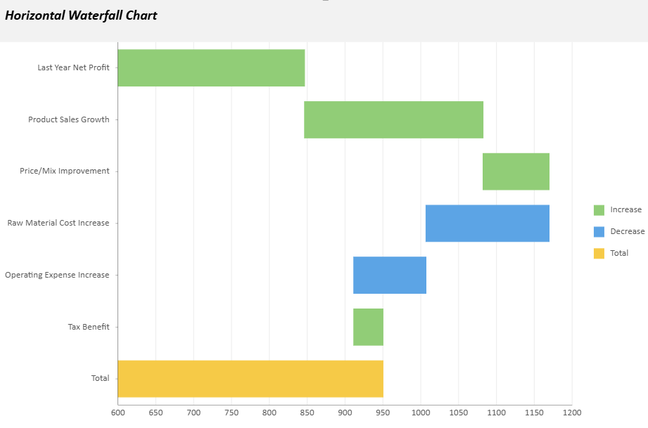 |
| `connectingLineStyle` | 막대 사이를 연결하는 선의 스타일을 정의합니다.
다음 속성을 사용자 지정할 수 있습니다.- `stroke` (선 색상)
- `strokeWidth` (선 두께)
- `strokeDasharray` (실선 또는 점선 패턴)
| 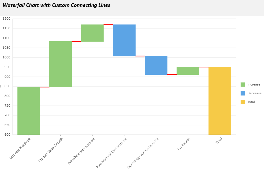 |
예제 구성:
```javascript
config: {
waterfall: {
showTotal: true,
totalLabel: "Net Profit",
orientation: "vertical",
connectingLineStyle: {
stroke: { type: 'CssColor', color: 'red' },
strokeWidth: 2,
strokeDasharray: "5,5"
}
}
}
```
## 고급 예제
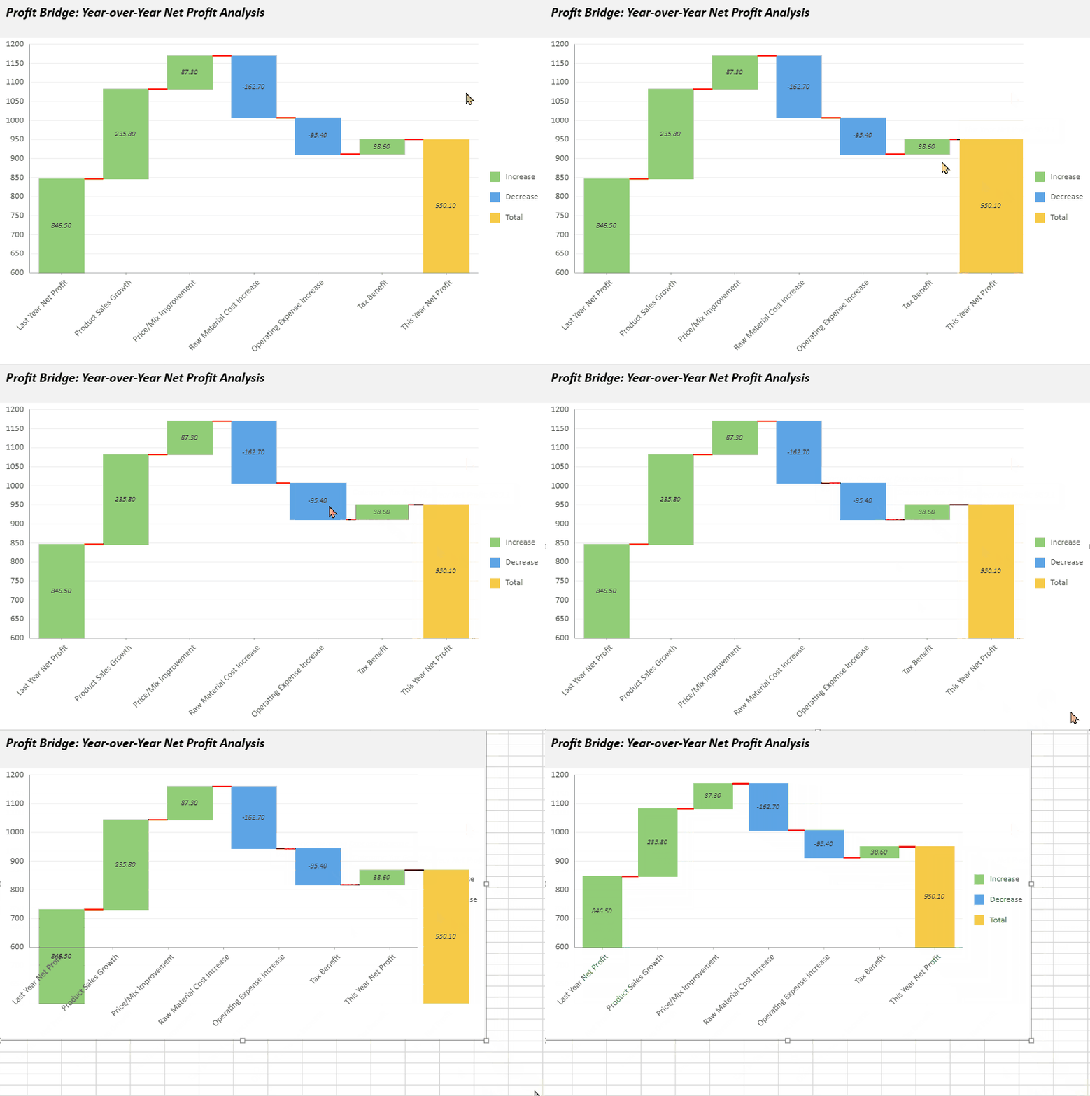
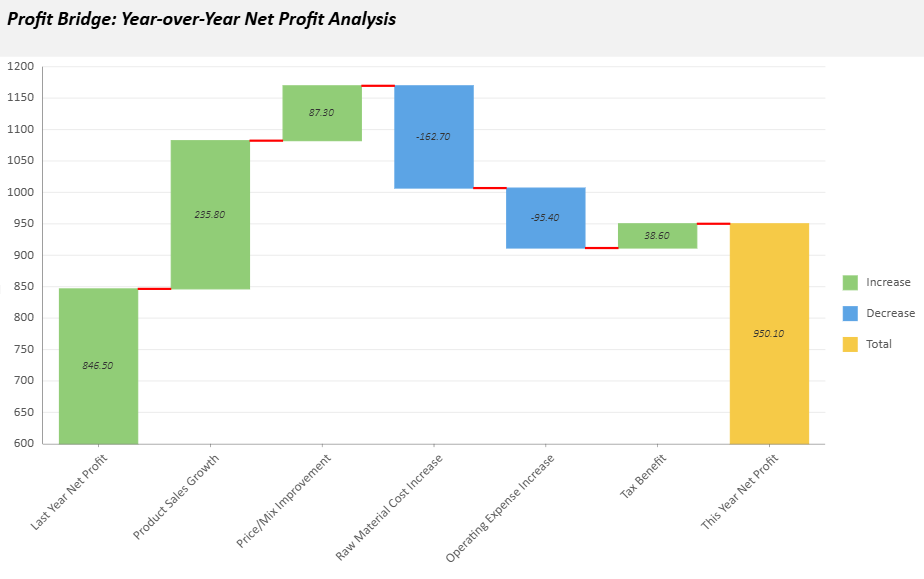
다음 샘플은 전년 대비 순이익 분석을 위한 폭포 차트를 생성합니다. 사용자 지정 차트 구성, 텍스트 스타일, 도구 설명 및 애니메이션 효과가 포함되어 있습니다.
```javascript
// Basic setup
const sheet = spread.getActiveSheet();
sheet.name("Waterfall Data Chart");
const dataManager = spread.dataManager();
function createProfitsTable(dataManager) {
const records = [
["Last Year Net Profit", 846.5],
["Product Sales Growth", 235.8],
["Price/Mix Improvement", 87.3],
["Raw Material Cost Increase", -162.7],
["Operating Expense Increase", -95.4],
["Tax Benefit", 38.6],
];
const columns = ["Category", "Value"];
return dataManager.addTable("Profits", {
data: records.map(record => {
const item = {};
columns.forEach((column, index) => item[column] = record[index]);
return item;
}),
});
}
const ProfitsTable = createProfitsTable(dataManager);
await ProfitsTable.fetch();
// Create a waterfall data chart
const dataChart = sheet.dataCharts.add('WaterfallChart6', 10, 10, 600, 400);
dataChart.setChartConfig({
tableName: 'Profits',
plots: [{
type: GC.Spread.Sheets.DataCharts.DataChartType.waterfall,
encodings: {
values: [{ field: 'Value', aggregate: GC.Spread.Sheets.DataCharts.Aggregate.sum }],
category: { field: 'Category' },
},
config: {
waterfall: {
totalLabel: 'This Year Net Profit',
connectingLineStyle: {
stroke: { type: 'CssColor', color: 'red' },
strokeWidth: 2,
},
},
text: [{
template: '{valueField.value}',
format: { value: '0.00' },
overlappingLabels: 'Hide',
position: GC.Spread.Sheets.DataCharts.TextPosition.center,
textStyle: {
fontFamily: 'Calibri',
fontSize: 10,
fontWeight: 'Lighter',
fontStyle: GC.Spread.Sheets.DataCharts.FontStyle.italic,
color: '#333333',
},
}],
tooltip: [{
style: {
fill: { type: 'CssColor', color: '#ffffff' },
stroke: { type: 'CssColor', color: '#e0e0e0' },
strokeWidth: 1,
},
textStyle: {
fontFamily: 'Calibri',
fontSize: 12,
fontWeight: 'Lighter',
fontStyle: GC.Spread.Sheets.DataCharts.FontStyle.italic,
color: '#333333',
},
}],
hoverAnimation: {
duration: 400,
easing: GC.Spread.Sheets.DataCharts.AnimationEasing.linear,
scale: 1.5,
},
updateAnimation: {
startDelay: 200,
duration: 1000,
easing: GC.Spread.Sheets.DataCharts.AnimationEasing.linear,
},
},
}],
config: {
header: {
title: 'Profit Bridge: Year-over-Year Net Profit Analysis',
padding: {
left: 10,
right: 10,
top: 10,
bottom: 20,
},
style: {
fill: { type: 'CssColor', color: '#f2f2f2' },
},
textStyle: {
color: 'black',
fontSize: 18,
fontStyle: GC.Spread.Sheets.DataCharts.FontStyle.italic,
fontWeight: 'Bold',
alignment: GC.Spread.Sheets.DataCharts.HAlign.left,
},
},
},
});
```