
Set Layouts using States
SpreadJS Designer Component provides different states which can be defined in the command options to display specific layouts.
inDropdown: Represents that the command is in the dropdown.
isToolbarMode : Represents the toolbar ribbon mode.
You can add custom states by using the designer.setData method.
You can define the above states in the command options by using formula expressions such as IF, AND, and NOT. The following code statements use different formula expressions to set the states in "text" and "bigButton" command options:
Sets the bigButton option to true when the command is not in the dropdown and when the ribbon is not in toolbar mode.
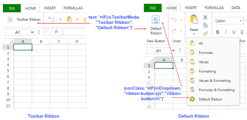
text: '=IF(isToolbarMode,"Toolbar Ribbon","Default Ribbon")'Sets the text as "Toolbar Ribbon" when in toolbar ribbon mode, otherwise sets as "Default Ribbon".
bigButton: '=AND(NOT(inDropdown), NOT(isToolbarMode))'Sets the bigButton option to true when the command is not in the dropdown and when the ribbon is not in toolbar mode.
Note: The commandName option does not support formula expressions.
Example
The image below illustrates different command text and icons between both the ribbon modes (default and toolbar) respectively.
The following code sample shows how to set the config states in the command options shown in the above image.
// Define Command "Welcome"
var command = {
    title: "Welcome",
    text: '=IF(isToolbarMode,"Toolbar Ribbon","Default Ribbon")',
    iconClass: '=IF(inDropdown, "ribbon-button-sjs","ribbon-button-hi")',
    bigButton: '=AND(NOT(inDropdown), NOT(isToolbarMode))',
    direction: '=IF(isToolbarMode, "horizontal","vertical")',
    visiblePriority: 1000,
    commandName: "Welcome",
    execute: async (context, propertyName, fontItalicChecked) => {
        alert('Welcome to new designer.');
    }
};

// Add command in default config command map
window.customRibbonConfig = GC.Spread.Sheets.Designer.DefaultConfig;

customRibbonConfig.commandMap = {
    Welcome: command
}

// Add button in default ribbon
customRibbonConfig.ribbon[0].buttonGroups.unshift({
    "label": "New Button",
    "thumbnailClass": "welcome",
    "commandGroup": {
        "children": [
            {
                "direction": "vertical",
                "commands": [
                    "Welcome"
                ]
            }
        ]
    }
});
customRibbonConfig.ribbon[0].buttonGroups[2].commandGroup.children[0].children.push('Welcome');

// Add command in toolbar config command map
window.customToolbarConfig = GC.Spread.Sheets.Designer.ToolBarModeConfig;
customToolbarConfig.commandMap = {
    Welcome: command
}

// Add button in toolbar ribbon
customToolbarConfig.ribbon.panels[0].buttonGroups.unshift({
    "buttonGroupName": "Welcome",
    "commandGroup": {
        "children": [
            "Welcome"
        ]
    }
});

// Initialize designer component with default ribbon mode
var designer = new GC.Spread.Sheets.Designer.Designer(document.getElementById("designer_host"));
designer.setConfig(customRibbonConfig);

// Set a button for switching between default and toolbar ribbon modes
document.getElementById('switch').addEventListener('click', function () {
    designer.setConfig(designer.getData('isToolbarMode') ? customRibbonConfig : customToolbarConfig)
});