- SpreadJS Overview
- Getting Started
- JavaScript Frameworks
- Best Practices
- Features
- SpreadJS Designer
-
SpreadJS Designer Component
- Getting Started
- Quick Start
- JavaScript Frameworks
-
Customizations
- Add a Tab
- Add Button in a Tab
- Create and Customize Page Layout Themes
- Add Context Menu Item
- Add New Dialog
- Set Default Active Ribbon Tab
- Enable or Disable Ribbon Elements
- Bind File Import Events
- Customize Status Bar
- Add a Custom Component
- Customize Designer Localization
- Customize File Menu
- Customize Format Culture Dialog
- Toolbar Ribbon
- API Documentation
- Touch Support
- Formula Reference
- Import and Export Reference
- Frequently Used Events
- API Documentation
- Release Notes
Customizations
SpreadJS Designer Component allows you to perform various customizations like:
Add a new ribbon tab for frequently used commands
Add a new button in a tab to save data
Add a new context menu item to lock the cell
Add a new dialog for customized operations
Designer Components Terminology
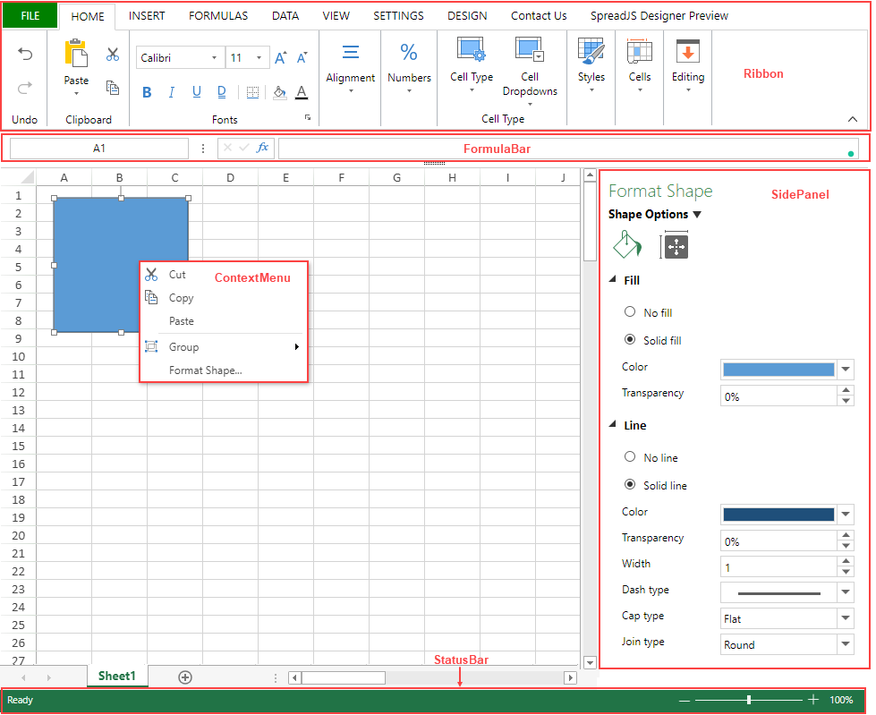
To customize designer components, it is important to understand their layout and terminology. The below image labels the terms specified for each designer component:

The below image labels the terms specified for ribbon components:

Access Default Configuration to Customize Designer Component
SpreadJS Designer Component provides the DefaultConfig field which contains the default configuration of designer components in a command tree structure. Using this, you can access and customize the designer component configuration:
var config = GC.Spread.Sheets.Designer.DefaultConfig;You can do desired customizations in the config structure and refer to it in your web application. Afterward, pass this customizable configuration as a parameter while initializing the designer component. This is explained in the below section.
Initialize Designer Component with Customizable Configuration
After customizing the default configuration, pass the customizable configuration as a parameter to GC.Spread.Sheets.Designer.Designer class. It can take up to 3 parameters as defined below:
// Initialize designer with customizable configuration and spread component
var designer = new GC.Spread.Sheets.Designer.Designer(document.getElementById("designerHost"), config, spread);
Here:
designerHost- HTMLElement represents the host element of the designerconfig- Object representing a customizable configuration JSON of the layoutspread- GC.Spread.Sheets.Workbook instance that represents the SpreadJS instance connected to the designer
The config and spread parameters are optional. When not provided, the designer uses the default designer components and generates a new spreadsheet.
Possible Customizations
The following points explain the extent of customizations possible in designer components:
The first level of designer components, including ribbon, context menu, file menu, and side panels can be deleted, but not modified or added.
The second level and corresponding sub-levels, including buttons, tabs, context menu options, etc. can be customized.
The response or interaction of each element can be customized by setting commandMap to register the command.
Example
One of the simplest Designer Component customizations is to control the state of the ribbon component. To launch the Designer Component with the collapsed ribbon, the setData method can be used to set the isRibbonCollapse state to true.
var designer = new GC.Spread.Sheets.Designer.Designer(document.getElementById("designerHost"));

// Sets state of the ribbon as collapsed.
designer.setData('isRibbonCollapse',true);
To perform various other customizations, refer following topics:


