
- SpreadJS Overview
- Getting Started
- JavaScript Frameworks
- Best Practices
- Features
- SpreadJS Designer
-
SpreadJS Designer Component
- Getting Started
- Quick Start
- JavaScript Frameworks
-
Customizations
- Add a Tab
- Add Button in a Tab
- Create and Customize Page Layout Themes
- Add Context Menu Item
- Add New Dialog
- Set Default Active Ribbon Tab
- Enable or Disable Ribbon Elements
- Bind File Import Events
- Customize Status Bar
- Add a Custom Component
- Customize Designer Localization
- Customize File Menu
- Customize Format Culture Dialog
- Toolbar Ribbon
- API Documentation
- Touch Support
- Formula Reference
- Import and Export Reference
- Frequently Used Events
- API Documentation
- Release Notes
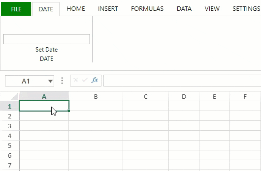
Add a Custom Component
You can add custom components to the Designer. For example, the following sample adds a 'Date Picker' component to the SpreadJS Designer Component.
Define a custom component class in your project.
// Add Custom Component
var DatePicker = defineCustomComponent();

//Build Component Class Structure
function defineCustomComponent() {
    function DatePicker() {
        GC.Spread.Sheets.Designer.AtomicComponentBase.call(this, ...arguments)
    };
    DatePicker.prototype = new GC.Spread.Sheets.Designer.AtomicComponentBase();
    // This function is used to define innerHTML of component
    DatePicker.prototype.getTemplate = function () {
        return `
            <div class="input-append date" style="margin-top: 35px;">
              <input size="20" class ='form_date' type="text">
            </div>
            `;
    }
    // Now the host element has been append to DOM, and you can add event listeners to it
    DatePicker.prototype.onMounted = function (host) {
        $(".form_date", host).datepicker();

        // When the datepicker changed, raise value changed event
        $(".form_date", host).change((e) => {
            this.raiseValueChanged()
        })
    }
    DatePicker.prototype.onValueChanged = function (prevValue, nextValue, host) {
        $(".form_date", host).datepicker('setDate', (nextValue && nextValue.toLocaleString) ? nextValue.toLocaleString('en-us', { year: 'numeric', month: 'numeric', day: 'numeric' }) : "");
    }
    // This function will be called after raiseValueChanged()
    DatePicker.prototype.updateValue = function (host) {
        var value = $(".form_date", host).datepicker('getDate')
        if (value) {
            return new Date(value);
        }
        return null;
    }
    // Remove the BootStrap datepicker and unbind the change event
    DatePicker.prototype.onDestroy = function (host) {
        $(".form_date", host).datepicker("destroy");
        $(".form_date", host).unbind("change");
    }

    return DatePicker;
}
Register the custom component to Designer using the Designer.RegisterComponent method.
// Register Custom Component to Designer
GC.Spread.Sheets.Designer.Designer.RegisterComponent("DatePicker", DatePicker);
Define the custom component command in the project.
// Custom Component Command Usage - implement a command
var date = initCommand();

//Implement a Command
function initCommand() {
    return {
        title: "Set Date",
        text: "Set Date",
        commandName: "date",
        type: 'DatePicker',
        execute: (designer, propertyName, value) => {
            let sheet = designer.getWorkbook().getActiveSheet();
            if (sheet) {
                var row = sheet.getActiveRowIndex();
                var col = sheet.getActiveColumnIndex();
                sheet.setValue(row, col, value);
            }
        },
        getState: (designer) => {
            var spread = designer.getWorkbook();
            var sheet = spread.getActiveSheet();
            var row = sheet.getActiveRowIndex();
            var col = sheet.getActiveColumnIndex();
            var value = sheet.getValue(row, col);
            return value;
        }
    };
}
Set the above command in the commandMap and add the custom component in the designer config.
// Custom Designer Config
var config = initConfig(date);

//Customize Designer Config
function initConfig(date) {
    var config = GC.Spread.Sheets.Designer.DefaultConfig;
    // Set command in commandMap
    config.commandMap = {
        cmdDatePicker: date
    }
    // Add custom component button in config
    var command = {
        text: "DATE",
        id: "date",
        buttonGroups: [
            {
                label: "DATE",
                commandGroup: {
                    direction: "horizontal",
                    commands: ["cmdDatePicker"]
                }
            }
        ]
    };
    config.ribbon.unshift(command);
    return config;
}
Initialize the designer instance by passing the relevant config parameter for customizable configuration.
// Create Designer With Config
designer = new GC.Spread.Sheets.Designer.Designer(designer_host, config);
The below output will be generated: