- SpreadJS Overview
- Getting Started
- JavaScript Frameworks
- Best Practices
-
Features
- Workbook
- Worksheet
- Rows and Columns
- Headers
- Cells
- Data Binding
- TableSheet
- GanttSheet
- JSON Schema with SpreadJS
- SpreadJS File Format
- Data Validation
- Conditional Formatting
- Sort
- Group
- Formulas
- Serialization
- Keyboard Actions
- Shapes
- Form Controls
- Floating Objects
- Barcodes
- Charts
- Sparklines
- Tables
- Pivot Table
- Slicer
- Theme
- Culture
- SpreadJS Designer
- SpreadJS Designer Component
- Touch Support
- Formula Reference
- Import and Export Reference
- Frequently Used Events
- API Documentation
- Release Notes
Customize Scrollbar
SpreadJS provides two types of scrollbars:
Classic Scrollbar (Skin appearance)
Customizable Scrollbar (Mobile appearance)
The default scrollbar is the classic scrollbar which can be referred here
. However, you can change the classic scrollbar to customizable one by setting ScrollbarAppearance enumeration to mobile . The customization of scrollbar includes various options, such as color, border, cap, hover, auto fade etc. These customizations in mobile appearance can be used to match a website's theme or specific style of a webpage.
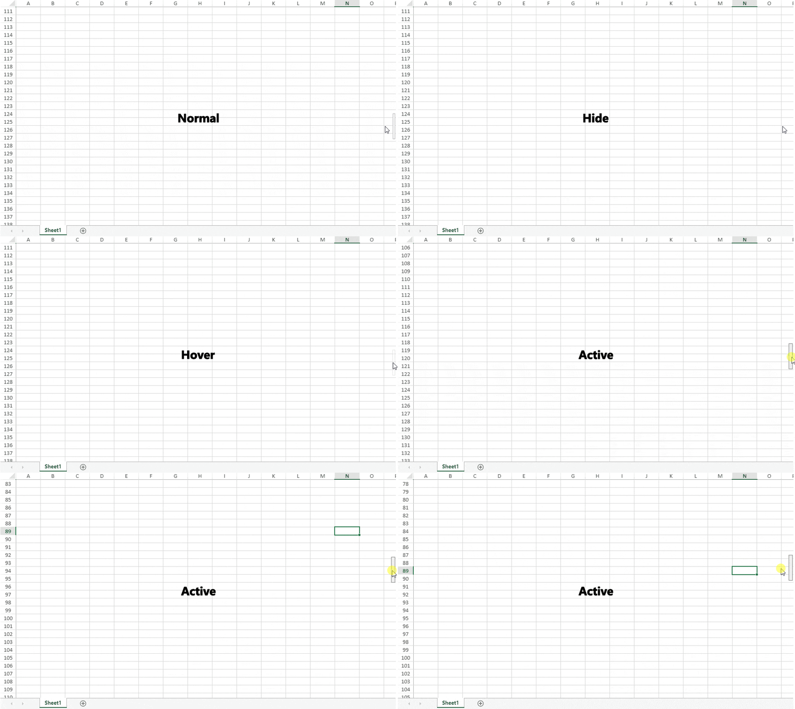
The mobile appearance displays four states of a scrollbar as explained below:
Hide : The scrollbar hides itself when the mouse is moved away from it, after a few seconds.
Normal : The scrollbar appears in normal state for a few seconds when the mouse is moved away from it. Other actions which display normal state are mouse wheel, traversing cells by keyboard, changing cell selection and sliding by touch.
Hover : The scrollbar width and color changes in hover state which occurs when mouse is hovered over the scrollbar.
Active : The active state of scrollbar occurs when the scrollbar is clicked and dragged in any direction. The scrollbar width, color and boundary changes as compared to normal state.

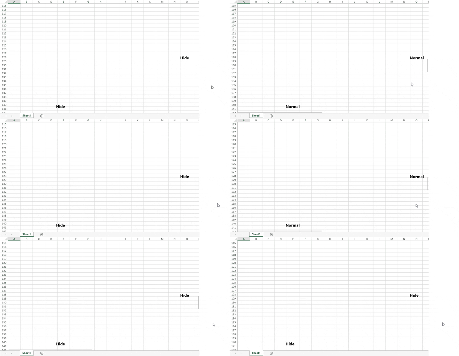
SpreadJS applies a special state of mobile appearance when the mouse enters a spread host:
spread-hovering : The scrollbar applies Normal and Hide states.

The difference between mobile and skin appearance of scrollbar has been explained below:
Scrollbar Behavior | Skin Apearance | Mobile Appearance |
|---|---|---|
Scrollable Area and Visibility | Gets affected by tab strip | Does not get affected by tab strip |
Arrows and Span | Visible | Invisible |
Note: In mobile appearance, the scrollbar ignores any frozen rows or columns.
Using Code
This example shows how to set the scrollbar appearance to mobile by using code.
// Set scrollbarAppearance to mobile
 spread.options.scrollbarAppearance = GC.Spread.Sheets.ScrollbarAppearance.mobile;
You can also customize the scrollbar style by using class names and styles as shown in below code:
 .gc-scroll-mobile-container {
       border-radius: 8px;
   }

   .gc-scroll-mobile-thumb {
       border-radius: 8px;
       border: none;
       background-color: skyblue;
       background-image: linear-gradient( 45deg, rgba(255, 255, 255, 0.2) 25%, transparent 25%, transparent 50%, rgba(255, 255, 255, 0.2) 50%, rgba(255, 255, 255, 0.2) 75%, transparent 75%, transparent );
   }

   .gc-scroll-mobile-state-active .gc-scroll-mobile-thumb {
       border: none;
       background-color: skyblue;
       background-image: linear-gradient( 45deg, rgba(255, 255, 255, 0.2) 25%, transparent 25%, transparent 50%, rgba(255, 255, 255, 0.2) 50%, rgba(255, 255, 255, 0.2) 75%, transparent 75%, transparent );
   }
The output of above code will display the scrollbar as below:

Please follow the below mentioned styles in corresponding class names to customize the appearance of scrollbar.
/* The recommended styles are in the {}. */

/* Scrollbar Container (Normal State) */
.gc-scroll-mobile-container { border-radius, opacity, padding }          /* The common style for scrollbar */
.gc-scroll-mobile-container-vertical { width }                           /* The style for vertical scrollbar */
.gc-scroll-mobile-container-horizontal { height }                        /* The style for horizontal scrollbar */

/* Scrollbar Thumb (Normal State) */
.gc-scroll-mobile-thumb { background, border, border-radius, opacity }   /* The style for scrollbar thumb */

/* Scrollbar Track (Normal State) */
.gc-scroll-mobile-track { background, border, border-radius, opacity }   /* The style for scrollbar track */

/* Combo class name, Add to Scrollbar Container */
.gc-scroll-mobile-spread-hovering                                        /* The style for scrollbar elements when mouse enter into spread host */
.gc-scroll-mobile-state-hide                                             /* The hide state style for scrollbar elements */
.gc-scroll-mobile-state-hover                                            /* The hover state style for scrollbar elements */
.gc-scroll-mobile-state-active                                           /* The active state style for scrollbar elements */
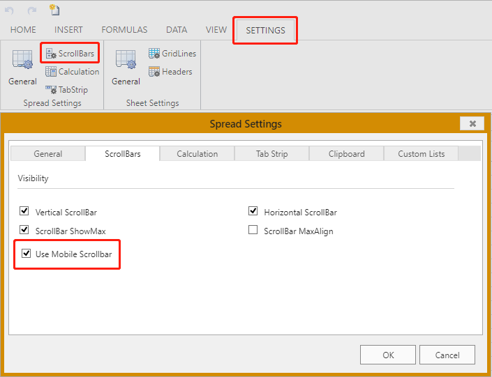
You can also set the mobile scrollbar in SpreadJS designer as shown below:


