- SpreadJS Overview
- Getting Started
- JavaScript Frameworks
- Best Practices
-
Features
- Workbook
- Worksheet
- Rows and Columns
- Headers
- Cells
- Data Binding
- TableSheet
- GanttSheet
- JSON Schema with SpreadJS
- SpreadJS File Format
- Data Validation
- Conditional Formatting
- Sort
- Group
- Formulas
- Serialization
- Keyboard Actions
- Shapes
- Form Controls
- Floating Objects
- Barcodes
- Charts
- Sparklines
- Tables
- Pivot Table
- Slicer
- Theme
- Culture
- SpreadJS Designer
- SpreadJS Designer Component
- Touch Support
- Formula Reference
- Import and Export Reference
- Frequently Used Events
- API Documentation
- Release Notes
Column Chart
A column chart represents data in vertical bars across the plot area on a horizontal axis. This type of chart is ideal for performing comparisons and analyses between two or more categories of data.
The data arranged in columns or rows of a worksheet can be plotted in a column chart.
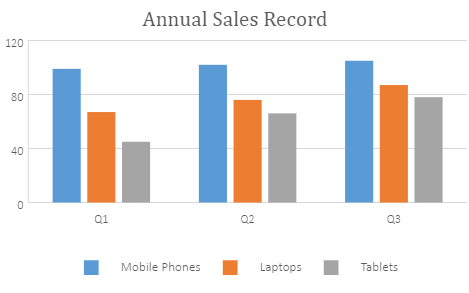
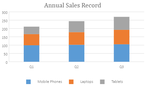
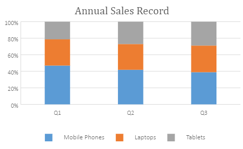
SpreadJS supports the following three types of column charts. In the examples shown below, the annual sales record for Quarter 1, Quarter 2, and Quarter 3 for different categories of gadgets: Mobile Phones, Laptops, and Tablets are depicted in different types of column charts.
Clustered Column Chart
A clustered column chart can be used when you want to compare different values across different categories and show them in two-dimensional or three-dimensional vertical rectangles. This chart can be stacked normally in a regular way just like any other chart.
An image of the clustered column chart is shown below:
Stacked Column Chart
A stacked column chart can be used when you want to display the relationship of specific items to the whole across different categories and plot values in two-dimensional or three-dimensional vertical rectangles. This chart stacks the data series vertically (in a vertical direction).
An image of the stacked column chart is shown below:
100% Stacked Column Chart
A 100% stacked column chart can be used when you want to perform comparisons of the percentages that each of the values are contributing to the total, across all your categories in the spreadsheet. This chart stacks the data series vertically and also equalizes the plotted values to meet 100%. The plotted values are displayed in two-dimensional and three-dimensional rectangles.
An image of the clustered column chart is shown below:
The following code sample shows how to add the three types of column charts in a spreadsheet.
var chart_columnClustered, chart_columnStacked, chart_columnStacked100, sheet;
        window.onload = function () {
            var spread = new GC.Spread.Sheets.Workbook(document.getElementById("ss"));
            sheet = spread.getActiveSheet();
            sheet.suspendPaint();
            //prepare data for chart
            sheet.setValue(0, 1, "Q1");
            sheet.setValue(0, 2, "Q2");
            sheet.setValue(0, 3, "Q3");
            sheet.setValue(1, 0, "Mobile Phones");
            sheet.setValue(2, 0, "Laptops");
            sheet.setValue(3, 0, "Tablets");
            for (var r = 1; r <= 3; r++) {
                for (var c = 1; c <= 3; c++) {
                    sheet.setValue(r, c, parseInt(Math.random() * 100));
                }
            }
//add columnClustered chart
            chart_columnClustered = sheet.charts.add('chart_columnClustered', GC.Spread.Sheets.Charts.ChartType.columnClustered, 250, 20, 600, 400, "A1:D4");
//add columnStacked chart
            chart_columnStacked = sheet.charts.add('chart_columnStacked', GC.Spread.Sheets.Charts.ChartType.columnStacked, 250, 480, 600, 400, "A1:D4");
//add columnStacked100 chart
            chart_columnStacked100 = sheet.charts.add('chart_columnStacked100', GC.Spread.Sheets.Charts.ChartType.columnStacked100, 250, 900, 600, 400, "A1:D4");
            sheet.resumePaint();
        };
Set Gap Width and Overlap
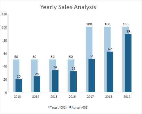
In the Column chart, you can set the gap width between the series (different categories on the primary axis) by using the gapWidth property. The value of the gapWidth property can be set between 0 and 5 and the default value of this property is 1.
Also, you can set the value for overlapping of series (in the same category on the primary axis) by using the overlap property. The value of this property must be between -1 and 1. If the value is set to -1, columns are positioned in such a way that there is a gap of one column between them. If the value is set to 1, columns are positioned on top of each other.
The following image displays an example of gap width and overlapping of series in the chart.
The following code sample shows how to set the gap width of the column chart along with overlap.
// Initializing Spread
var spread = new GC.Spread.Sheets.Workbook(document.getElementById('ss'), { sheetCount: 1 });
// Get the activesheet
var activeSheet = spread.getSheet(0);
// Prepare data for chart
var dataArray =
[
    ['Year', 'Actual (00$)', 'Target (00$)'],
    ['2013', 20, 50],
    ['2014', 24, 50],
    ['2015', 34, 50],
    ['2016', 32, 50],
    ['2017', 51, 100],
    ['2018', 62, 100],
    ['2019', 89, 100]

];
// Set data for chart
activeSheet.setArray(0, 0, dataArray);
// Set column widths and visibility
activeSheet.setColumnWidth(1, 90);
activeSheet.setColumnWidth(2, 90);

// Add columnClustered chart
chart_colClustured = activeSheet.charts.add('chart_colClustured', GC.Spread.Sheets.Charts.ChartType.columnClustered, 270, 20, 500, 400);
// Add series to columnClustured chart
var series = chart_colClustured.series();
series.add({
    chartType: GC.Spread.Sheets.Charts.ChartType.columnClustered,
    axisGroup: GC.Spread.Sheets.Charts.AxisGroup.primary,
    name: "Sheet1!$C$1",
    xValues: "Sheet1!$A$2:$A$8",
    yValues: "Sheet1!$C$2:$C$8",

});

series.add({
    chartType: GC.Spread.Sheets.Charts.ChartType.columnClustered,
    axisGroup: GC.Spread.Sheets.Charts.AxisGroup.primary,
    name: "Sheet1!$B$1",
    xValues: "Sheet1!$A$2:$A$8",
    yValues: "Sheet1!$B$2:$B$8"
});

// Hide gridlines from the chart
var gridLinesAxes = chart_colClustured.axes();
gridLinesAxes.primaryCategory.majorGridLine.visible = false;
gridLinesAxes.primaryValue.majorGridLine.visible = false;
chart_colClustured.axes(gridLinesAxes);

// Get title and set it's text
var title = chart_colClustured.title();
title.fontSize = "24.00";
title.text = "Yearly Sales Analysis";
chart_colClustured.title(title);

// Set series(0) backColor
var seriesItem = chart_colClustured.series().get(0);
seriesItem.backColor = "#A9CCE3";
chart_colClustured.series().set(0, seriesItem);

// Set series(1) backColor
var seriesItem = chart_colClustured.series().get(1);
seriesItem.backColor = "#1F618D";
// Set series's GapWidth
seriesItem.gapWidth = 2;
// Set series's overlap
seriesItem.overlap = 0.6;
chart_colClustured.series().set(1, seriesItem);

// Set chart's dataLabels
chart_colClustured.dataLabels
    ({
        showValue: true,
        color: "black"
    });

// Set the style for cells
var style = new GC.Spread.Sheets.Style();
style.font = "bold 12px Arial";
style.foreColor = "white";
style.backColor = "#5B9BD5";
style.hAlign = GC.Spread.Sheets.HorizontalAlign.center;
style.vAlign = GC.Spread.Sheets.VerticalAlign.center;
for (var i = 0; i < 3; i++)
    activeSheet.setStyle(0, i, style, GC.Spread.Sheets.SheetArea.viewport);
Invert Negative Values
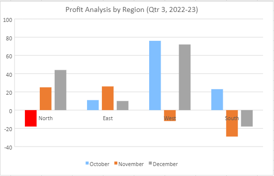
While plotting negative values on a bar chart, SpreadJS lets you invert the color of negative values by setting invertIfNegative option to true. It helps in highlighting and differentiating negative values from positive values. The default invert color is rgb(255,255,255). You can also specify the same by using invertColor option. If the fill color of the series chart is set to a pattern, SpreadJS ignores the invertColor value and, swaps the fore color and back color of the pattern to apply inverted formatting to the negative values.
The following image shows how a negative value of Series 1(October) displays in inverted color.
The following code sample shows how to invert the color of negative values plotted on a column chart.
// initializing Spread.
var spread = new GC.Spread.Sheets.Workbook(document.getElementById('ss'), { sheetCount: 1 });
var sheet = spread.getActiveSheet();
sheet.suspendPaint();
// prepare data for chart.
var dataArray = [
    [, 'North', 'East', 'West', 'South'],
    ['October', -18, 11, 76, 23],
    ['November', 25, 26, -12, -29],
    ['December', 44, 10, 72, -18],
];
sheet.setArray(0, 0, dataArray);
var chart = sheet.charts.add('Chart1', GC.Spread.Sheets.Charts.ChartType.columnClustered, 350, 20, 600, 400, 'A1:E4');
var title = chart.title();
title.text = 'Profit Analysis by Region (Qtr 3, 2022-23)';
title.fontSize = 16;
title.fontFamily = 'Calibri';
chart.title(title);
// set series1's invertIfNegative to true and invertColor to black.
var series1 = chart.series().get(0);
series1.backColor = "cyanblue";
series1.invertIfNegative = true;
series1.invertColor = "red";
chart.series().set(0, series1);
sheet.resumePaint();

