
- SpreadJS Overview
- Getting Started
- JavaScript Frameworks
- Best Practices
-
Features
- Workbook
- Worksheet
- Rows and Columns
- Headers
- Cells
- Data Binding
- TableSheet
- GanttSheet
- JSON Schema with SpreadJS
- SpreadJS File Format
- Data Validation
- Conditional Formatting
- Sort
- Group
- Formulas
- Serialization
- Keyboard Actions
- Shapes
- Form Controls
- Floating Objects
- Barcodes
- Charts
- Sparklines
- Tables
- Pivot Table
- Slicer
- Theme
- Culture
- SpreadJS Designer
- SpreadJS Designer Component
- Touch Support
- Formula Reference
- Import and Export Reference
- Frequently Used Events
- API Documentation
- Release Notes
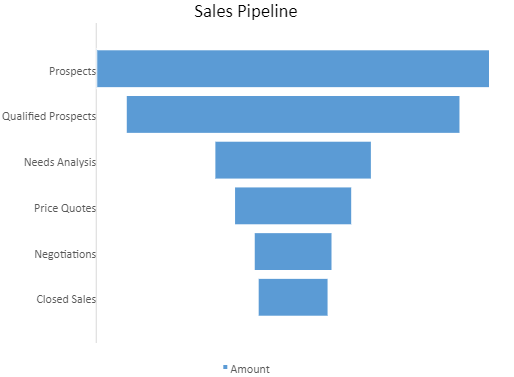
Funnel Chart
A funnel chart is commonly used to visualize a linear process that contains sequential connected stages. This chart is ideal for evaluating sales cycles in businesses.
The data arranged in columns or rows of a worksheet can be plotted in a funnel chart. Each stage in a funnel chart represents a proportion of the total. Therefore, it takes the shape of a funnel with the first stage being the largest and each subsequent stage getting smaller than the predecessor.
The example shown below depicts the number of sales prospects at each sequential stage in a sales pipeline, and the length of the bar associated with each stage represents the number of customers at each stage. The use case analyzes sales at each stage, beginning with prospects (potential customers) and qualified prospects (clients who express interest in your business) on the top, then down to Price Quotes, Negotiations, and Closed Sales (confirmed clients) at the end.
The following code sample shows how to add a funnel chart to a Spreadsheet.
// get the activesheet
var sheet = spread.getActiveSheet();

//prepare data for chart
var dataArray = [
    ['Stage', 'Amount'],
    ['Prospects', 500],
    ['Qualified Prospects', 425],
    ['Needs Analysis', 200],
    ['Price Quotes', 150],
    ['Negotiations', 100],
    ['Closed Sales', 90]
];

sheet.setArray(1, 1, dataArray);

//add funnel chart
var chart = sheet.charts.add('chart1', GC.Spread.Sheets.Charts.ChartType.funnel, 300, 0, 500, 400, "B2:C8");

//set chart title
var title = chart.title();
title.text = "Sales Pipeline";
chart.title(title);

//set data labels
var dataLabels = chart.dataLabels();
dataLabels.showValue = true;
dataLabels.color = 'white';
chart.dataLabels(dataLabels);