- SpreadJS Overview
- Getting Started
- JavaScript Frameworks
- Best Practices
-
Features
- Workbook
- Worksheet
- Rows and Columns
- Headers
-
Cells
- Work with Cells
- Cell Types
- Cell Format
- Cell States
- Cell Range
- Get Dirty Status
- Cell Buttons
- Cell Dropdowns
- Cell Comments
- Hyperlink
- Auto Merge Cells
- AutoFit
- Auto Fill Data
- Mask Input
- Shrink to Fit
- Cell Overflow
- Ellipsis or Tips for Cell Overflow
- Cell Alignment and Indentation
- Cell Padding and Label Styles
- Cell Span
- Cell Tags
- Styles
- Cell Decoration
- Cell Colors
- Borders, Gridlines and Diagonal Lines
- Quote Prefix
- Insert Cut or Copied Cells
- Rotate Text In Cells
- Vertical Text Direction
- Text Decoration
- Rich Text
- Wrap Text
- Drag and Drop
- Drag and Merge
- Edit Mode Always
- Watermark
- Display Zero as Blank
- IME Mode
- Pattern Fill and Gradient Fill
- Paste Options
- Data Binding
- TableSheet
- GanttSheet
- JSON Schema with SpreadJS
- SpreadJS File Format
- Data Validation
- Conditional Formatting
- Sort
- Group
- Formulas
- Serialization
- Keyboard Actions
- Shapes
- Form Controls
- Floating Objects
- Barcodes
- Charts
- Sparklines
- Tables
- Pivot Table
- Slicer
- Theme
- Culture
- SpreadJS Designer
- SpreadJS Designer Component
- Touch Support
- Formula Reference
- Import and Export Reference
- Frequently Used Events
- API Documentation
- Release Notes
Cell Buttons
Cell buttons are a set of predefined buttons that can be added to worksheet cells to configure additional functionalities. They allow you to configure specific behavior for operations like when a user clicks on a cell button, edits a cell, or hovers over a cell. The cellbuttons type belongs to the Style class, hence it allows you to create named styles that would apply selectively and easily on any cell.
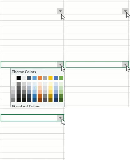
For example, you can create a button with a color picker drop-down by defining a custom color-picker named style for the cell. This style can be reused and applied to any other cell.
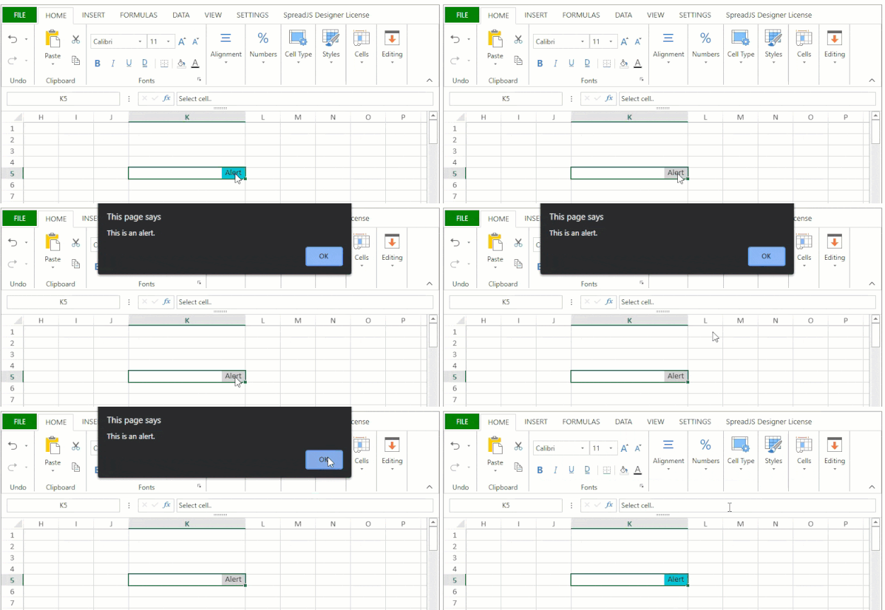
The following GIFs display the usage of some cell buttons commands and properties to achieve the desired customizations.
Cell button with 'Insert' caption

// Configure Workbook and Worksheet
var spread = new GC.Spread.Sheets.Workbook(document.getElementById("ss"));
var activeSheet = spread.getActiveSheet();

// Add a basic button with caption
var basicButttonStyle = new GC.Spread.Sheets.Style();
basicButttonStyle.cellButtons =
[
    {
        caption: "Insert"
    }
];
activeSheet.setText(2, 3, "Basic button with caption");
activeSheet.setStyle(2, 4, basicButttonStyle);
Cell button with 'enabled' property set to true and false

// Configure Workbook and Worksheet
var spread = new GC.Spread.Sheets.Workbook(document.getElementById("ss"));
var activeSheet = spread.getActiveSheet();

// Add button with different configuration settings such as position, style, enabled/disabled
var customButtonStyle = new GC.Spread.Sheets.Style();
customButtonStyle.cellButtons =
[
    {
        caption: "enable",
        useButtonStyle: true,
        // enabled: true,
        hoverBackColor: "#3390FF",
        position: GC.Spread.Sheets.ButtonPosition.left
    },
    {
        caption: "disabled",
        useButtonStyle: false,
        enabled: false,
        position: GC.Spread.Sheets.ButtonPosition.right
    }
];
activeSheet.setText(4, 3, "enabled/disabled buttons");
activeSheet.setStyle(4, 4, customButtonStyle);
Cell button set to be visible on selecting cell.

// Configure Workbook and Worksheet
var spread = new GC.Spread.Sheets.Workbook(document.getElementById("ss"));
var activeSheet = spread.getActiveSheet();

// Add button visibility property
var onScreenstyle = new GC.Spread.Sheets.Style();
onScreenstyle.cellButtons = [
     {
        caption: "On Select",
        buttonBackColor:"#ffdc9d",
        visibility: GC.Spread.Sheets.ButtonVisibility.onSelected
   }
];
activeSheet.setStyle(10, 10, onScreenstyle);
activeSheet.getCell(10,10).value("Select cell..").vAlign(GC.Spread.Sheets.VerticalAlign.bottom);
Cell Buttons with built-in and custom images

// Configure Workbook and Worksheet
var spread = new GC.Spread.Sheets.Workbook(document.getElementById("ss"));
var activeSheet = spread.getActiveSheet();

// Add button with built-in and custom image
var ImageStyle = new GC.Spread.Sheets.Style();
ImageStyle.cellButtons =
[
    {
        useButtonStyle: true,
        imageSize: {
                height: 8,
                width: 8
        },
        imageType: GC.Spread.Sheets.ButtonImageType.ellipsis
    },
    {
        useButtonStyle: true,
        imageType: GC.Spread.Sheets.ButtonImageType.custom,
        imageSrc:"data:image/bmp;base64, Qk1eAAAAAAAAAD4AAAAoAAAACAAAAAgAAAABAAEAAAAAACAAAADEDgAAxA4AAAAAAAAAAAAAAAAAAP///wB+AAAApQAAANsAAAClAAAApQAAANsAAAClAAAAfgAAAA=="
    }
];
activeSheet.setText(6, 3, "Image Buttons");
activeSheet.setStyle(6, 4, ImageStyle);
Cell Button with command function set to perform zoom-in and zoom-out operation in a worksheet

// Configure Workbook and Worksheet
var spread = new GC.Spread.Sheets.Workbook(document.getElementById("ss"));
var activeSheet = spread.getActiveSheet();

// Add button with command function
var buttonCommandfunction = new GC.Spread.Sheets.Style();
buttonCommandfunction.cellButtons =
[
    {
        imageType: GC.Spread.Sheets.ButtonImageType.search,
        command: (sheet, row, col, option) =>
        {
            if (sheet.zoom() === 1) {
                sheet.zoom(1.5);
            } else {
                sheet.zoom(1);
            }
        }
    }
];
activeSheet.setText(10, 3, "Button with command function");
activeSheet.setStyle(10, 4, buttonCommandfunction);
Cell Button with command function set to trigger an alert message

// Configure Workbook and Worksheet
var spread = new GC.Spread.Sheets.Workbook(document.getElementById("ss"));
var activeSheet = spread.getActiveSheet();

// Add button with Alert command action
var visibleStyle = new GC.Spread.Sheets.Style();
visibleStyle.cellButtons =
[
    {
        caption:"Alert",
        buttonBackColor: "#00C2D6",
        command: (sheet, row, col, option) => {
            alert("This is an alert.");
        }
    }
];
activeSheet.setStyle(7, 10, visibleStyle);
Cell button set to dropdown ButtonImageType enum value and opencolorpicker command

// Configure Workbook and Worksheet
var spread = new GC.Spread.Sheets.Workbook(document.getElementById("ss"));
var activeSheet = spread.getActiveSheet();

// Add Dropdown button with command action
var dropdownStylecommand = new GC.Spread.Sheets.Style();
dropdownStylecommand.cellButtons =
[
    {
        imageType: GC.Spread.Sheets.ButtonImageType.dropdown,
        useButtonStyle: true,
        command: "openColorPicker"
    }
];
activeSheet.setText(8, 3, "Dropdown button with command");
activeSheet.setStyle(8, 4, dropdownStylecommand);
Configure Cell Buttons
You can configure cell buttons by using different properties as described in the table below:
Property | Description |
|---|---|
ButtonPosition | This property is of type ButtonPosition enumeration that specifies the position of the cell button. You can set the position of the cell button to left or right and create a custom style for displaying these buttons. |
CaptionAlignment | This property is of type CaptionAlignment enumeration that specifies the position of the caption in the cell button. You can configure the position of the caption to left or right. |
ButtonImageType | This property is of type ButtonImageType enumeration that specifies the image type of the cell button. You can configure the button image type as per the specific preferences such as dropdown, search, undo, and redo. Refer to ButtonImageType Enumeration for the complete list. |
ButtonVisibility | This property is of type ButtonVisibility enumeration that specifies the visibility of the cell button. You can choose whether to show or hide the cell buttons on different cell states using the following values: |
caption | This property specifies the text of the button that will be displayed in the caption. |
position | This property specifies the position of the button in the cell. |
enabled | This property specifies whether the cell button will respond to the user's actions. The default value is set to true. |
useButtonStyle | This property specifies whether the cell button is a button style. The default value is false. |
width | This property specifies the width of the button. If you set this property to "null" or "undefined" then the button fit will automatically adjust itself based on the caption and the size of the image. |
visibility | This property specifies the visibility of the button. Three options are available ("always", "onselect" and "edit"). |
imageType | This property specifies the type of image that you want to display in the button. The default value for this property is "custom". |
command | This property allows you to execute a spread command or a callback when the cell button is clicked. |
imageSrc | This property allows you to upload an image by providing the source of the image when the imageType is set to custom. |
captionAlign | This property specifies the position of the image and the caption. The available options are "left" and "right". |
imageSize | This property specifies the image size. The default value is 16px. |
hoverBackColor | This property specifies the hover back color of the cell button when the button is visible and enabled. |
Define Button Commands
After creating the cell button, you can specify different command actions to associate different functionalities to the buttons as per the options mentioned in the following table.
Command Option | Description |
|---|---|
openColorPicker | This option can be used when you want to open a color picker on a button click event. |
openDateTimePicker | This option can be used when you want to open a date time picker on a button click event. |
openTimePicker | This option can be used when you want to open a time picker on a button click event. |
openMonthPicker | This option can be used when you want to open a month picker on button click event. |
openSlider | This option can be used when you want to open a slider control on button click event. |
openWorkflowList | This option can be used when you want to open a workflow list on a button click event. |
openCalculator | This option can be used when you want to open a calculator on a button click event. |
openList | This option can be used when you want to open a list on a button click event. |
Note: You can use and customize the above commands in the dropdown setting of a cell button as well, refer to Cell Dropdowns for more details.


